


Lateral Frontiers → The Brand Evolution Powering $89B in Value
How the Rvysion Team Crafted a Timeless and Bold Identity for a $89B+ Portfolio VC Firm
Brand & Visual Identity,
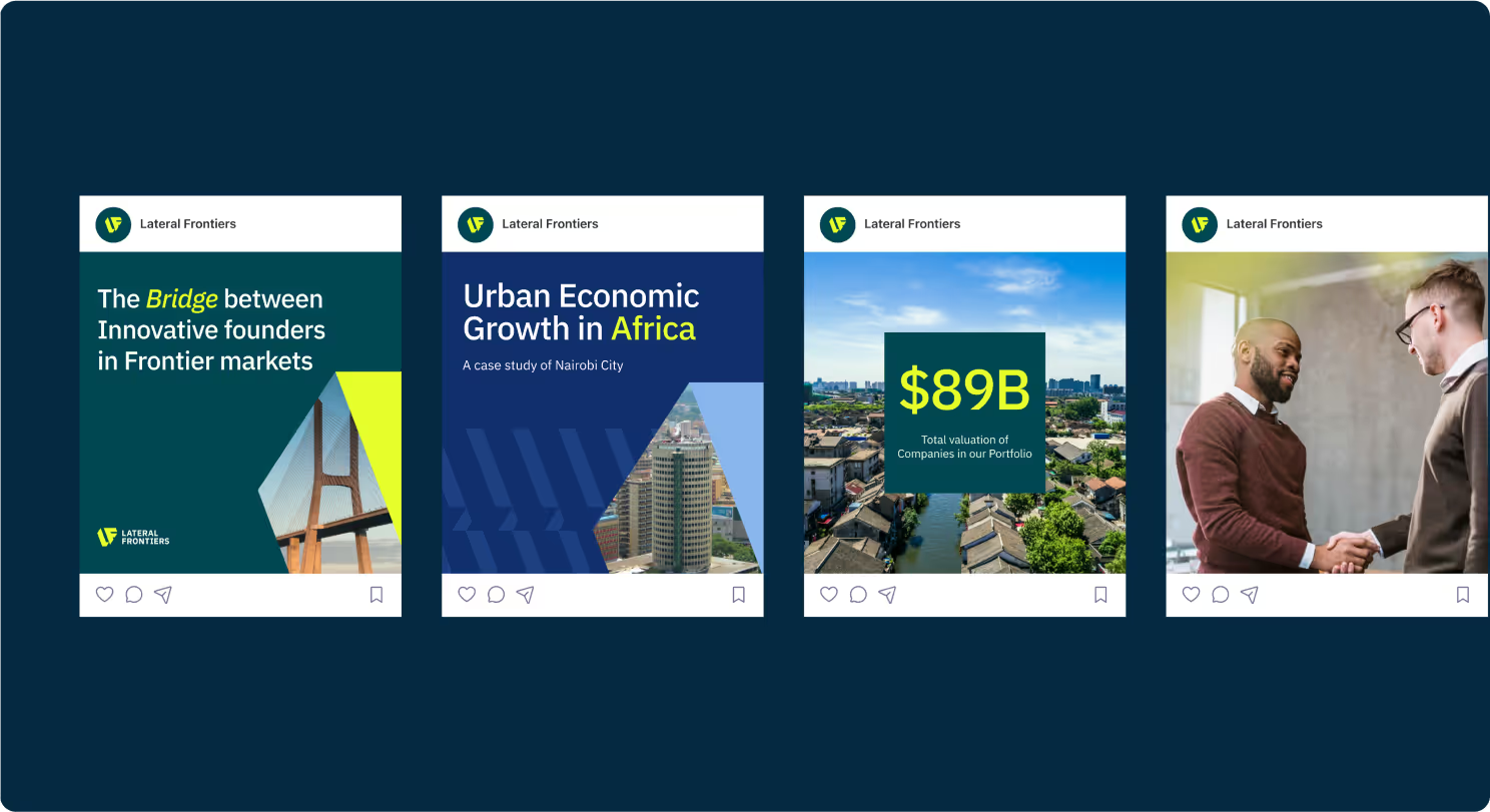
Social media
(THE BRAND)
Lateral Frontiers is a thesis-led venture capital firm investing in frontier markets. Their mission is to empower visionary founders building transformative technologies across Africa and other emerging economies. With a portfolio of companies collectively valued at $89B, Lateral Frontiers is known for backing entrepreneurs solving real-world challenges in fintech, healthcare, education, cleantech, housing, and beyond.
As the firm prepared for its next phase of growth, it needed a brand identity that reflected its bold vision and timeless ethos: one that could resonate equally with founders, investors, and global partners.
( THE CHALLENGE )
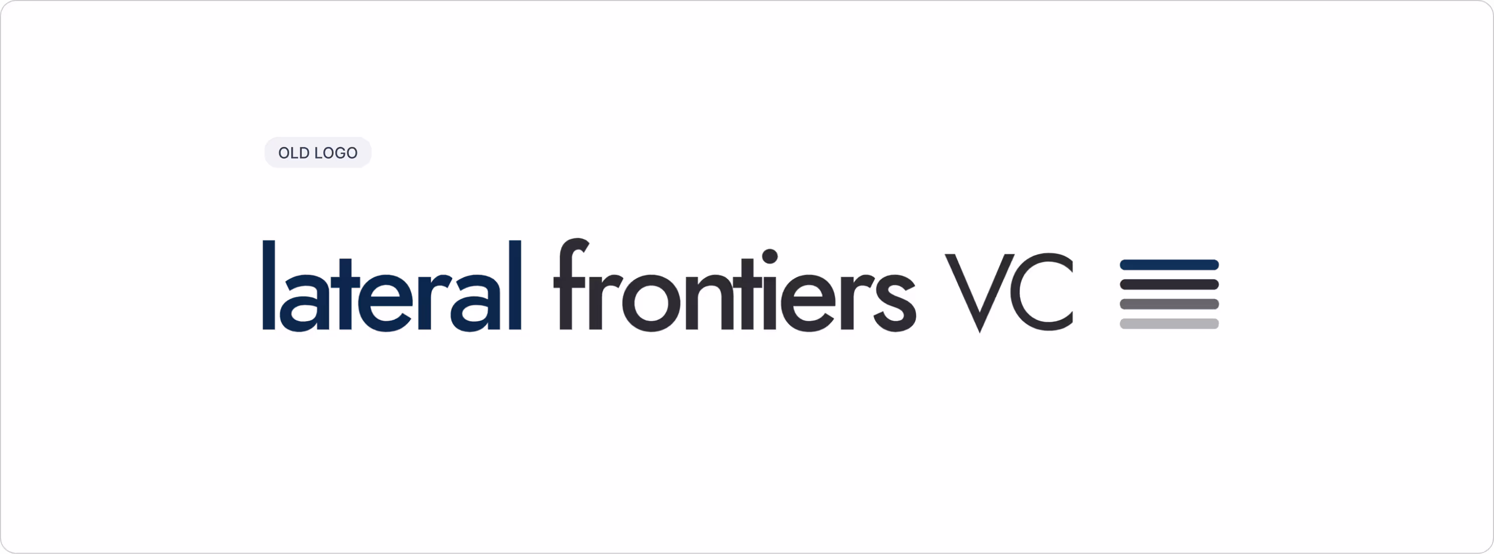
Lateral’s original logo, website, and brand presence were functional but limited. They didn’t reflect the firm’s growing reputation or align with its mission of shaping future-defining companies. The challenges were clear:
Lack of cohesion → the old brand identity didn’t unify touchpoints.
Limited impact → visuals failed to capture the ambition of their investment thesis.
Global positioning → the brand lacked the polish expected by international founders and LPs.
Our challenge was to create an identity that positioned Lateral Frontiers as credible, visionary, and human while standing out in the competitive VC landscape.
( THE APPROACH )
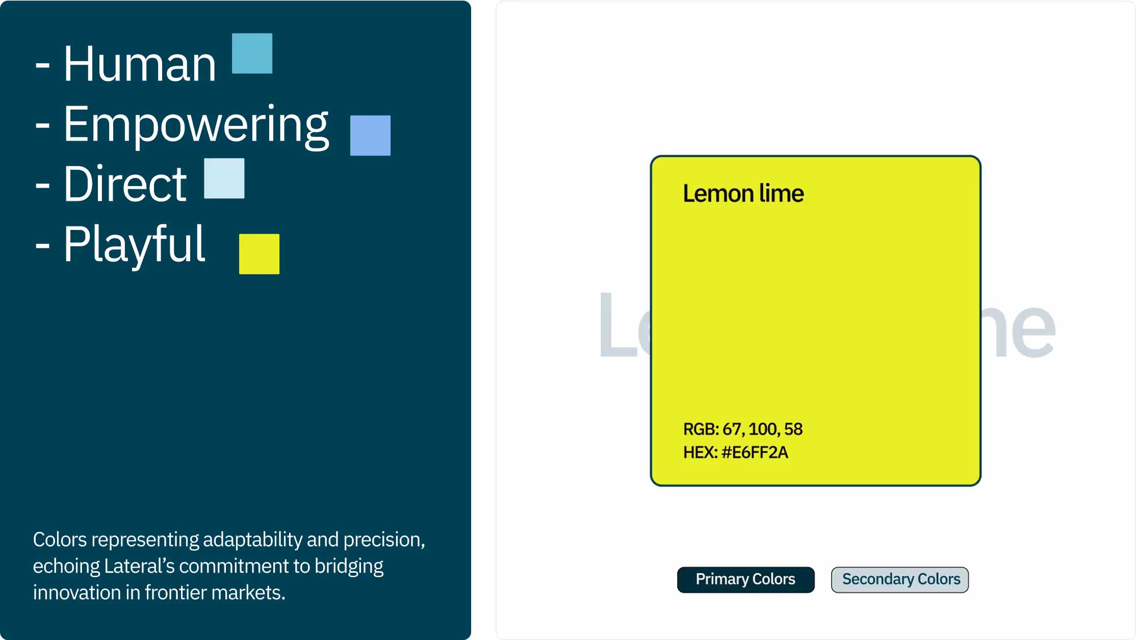
We started with deep discovery, immersing ourselves in Lateral’s story, thesis, and ethos. Our branding strategy centered on three themes: growth, innovation, and collaboration.
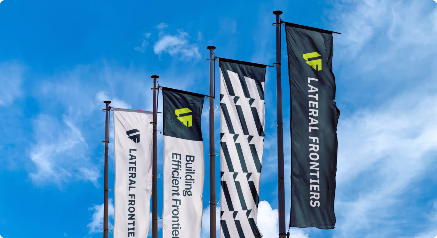
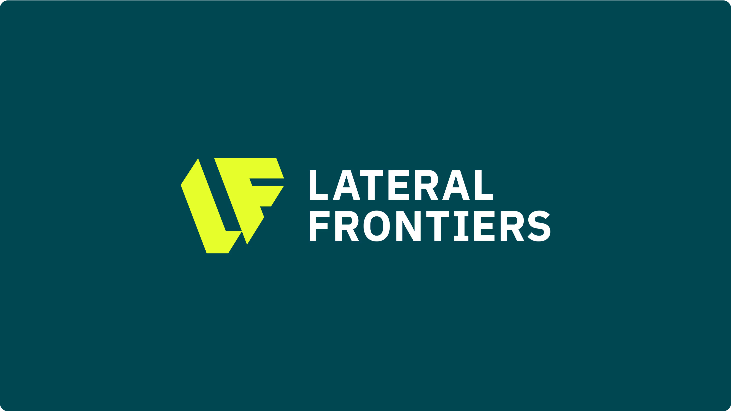
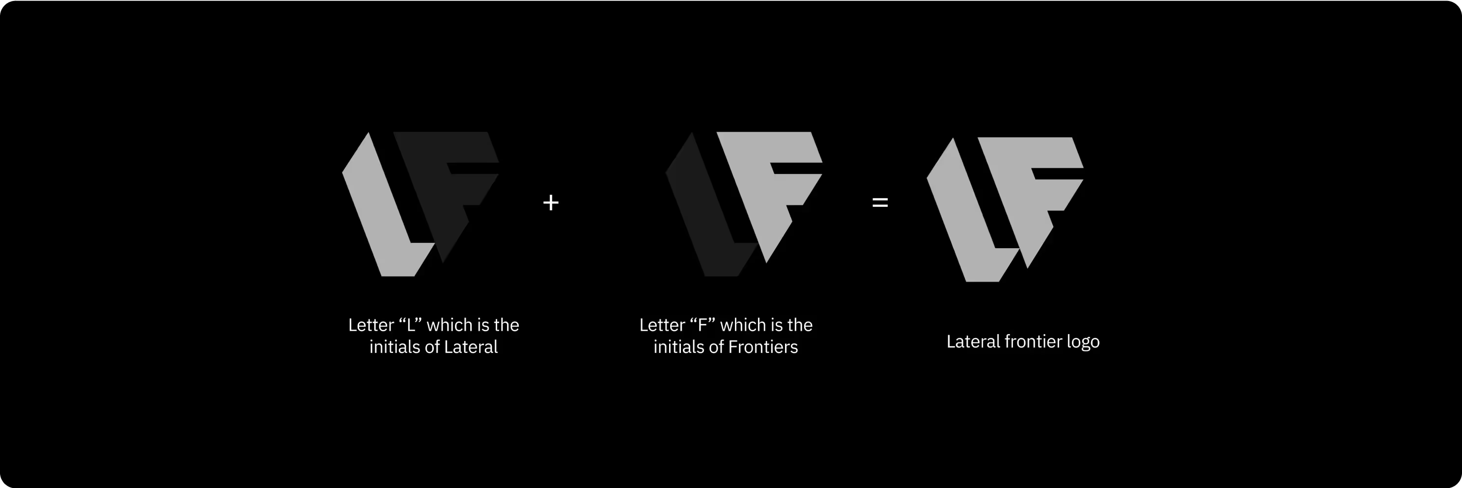
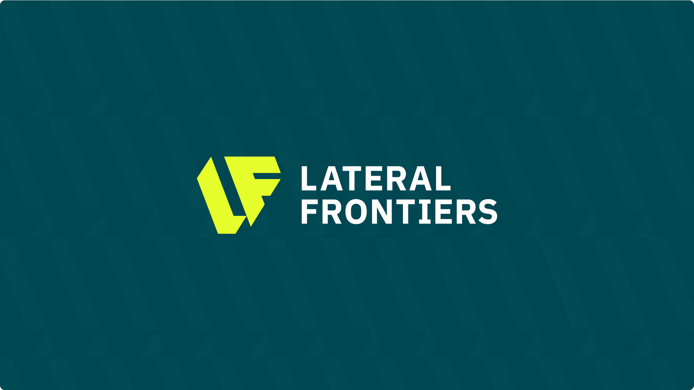
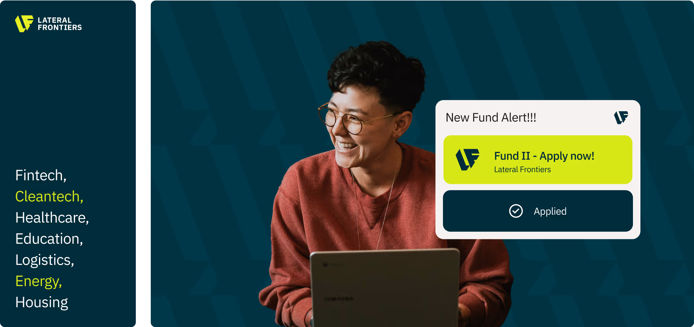
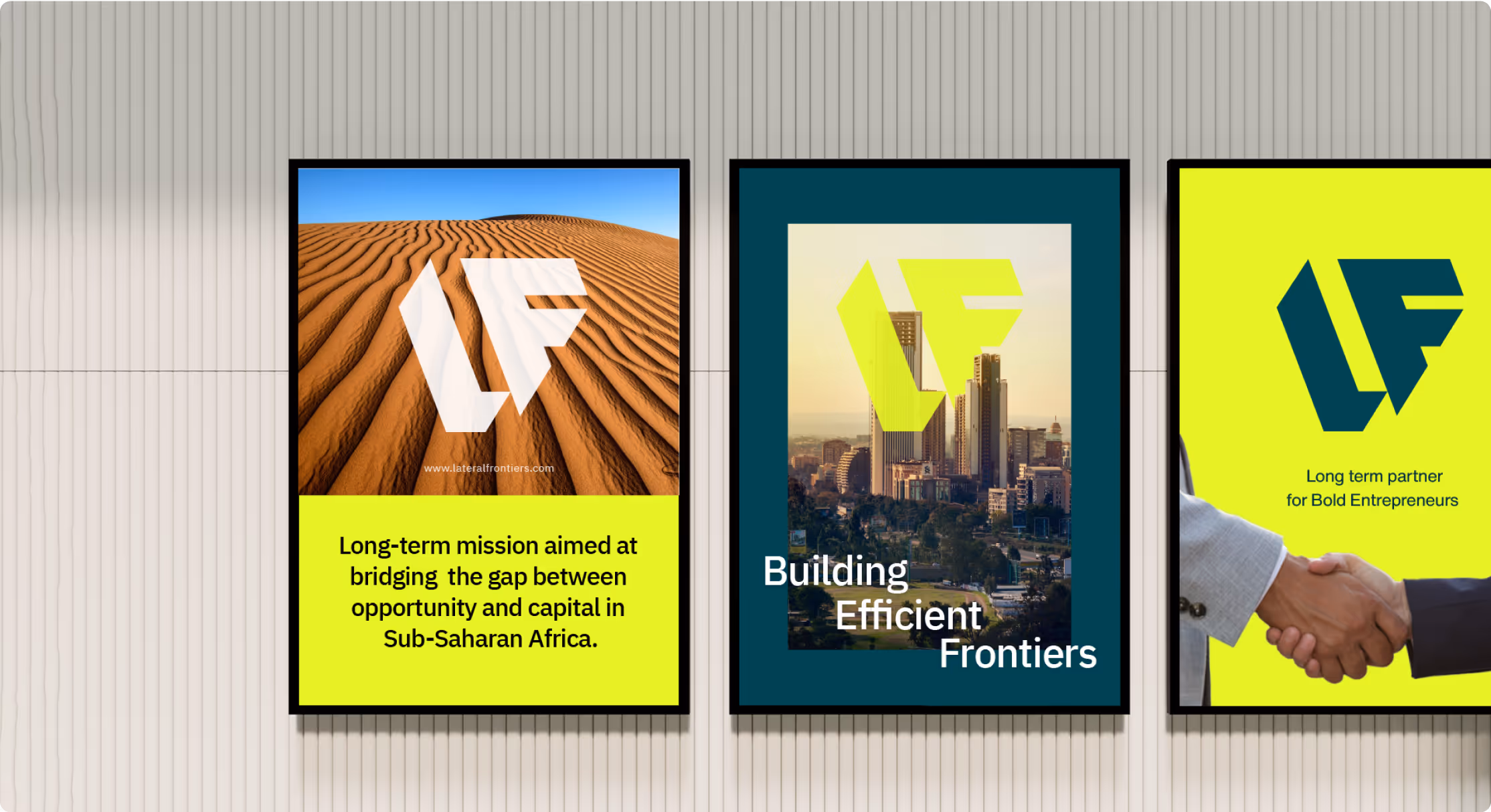
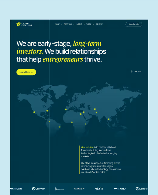
Logo Design → We crafted the “LF” monogram, symbolizing the fusion of innovation and collaboration. Its clean geometry communicates strength, precision, and modernity.
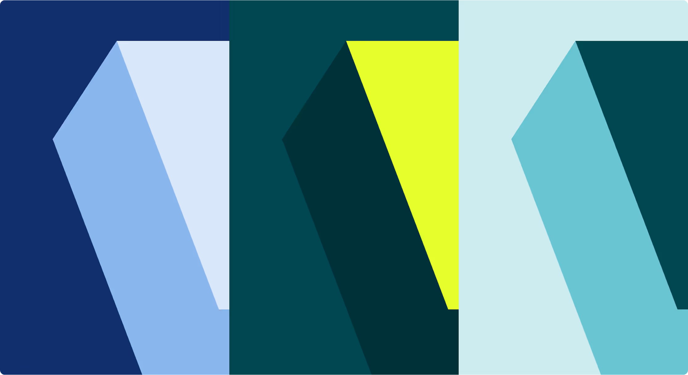
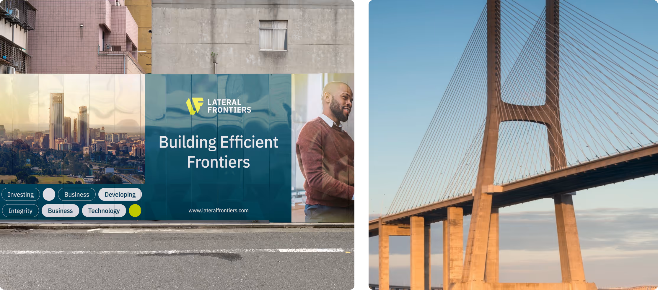
Color Palette → Bold green and lemon yellow were introduced to represent optimism, energy, and growth — balancing seriousness with playfulness.
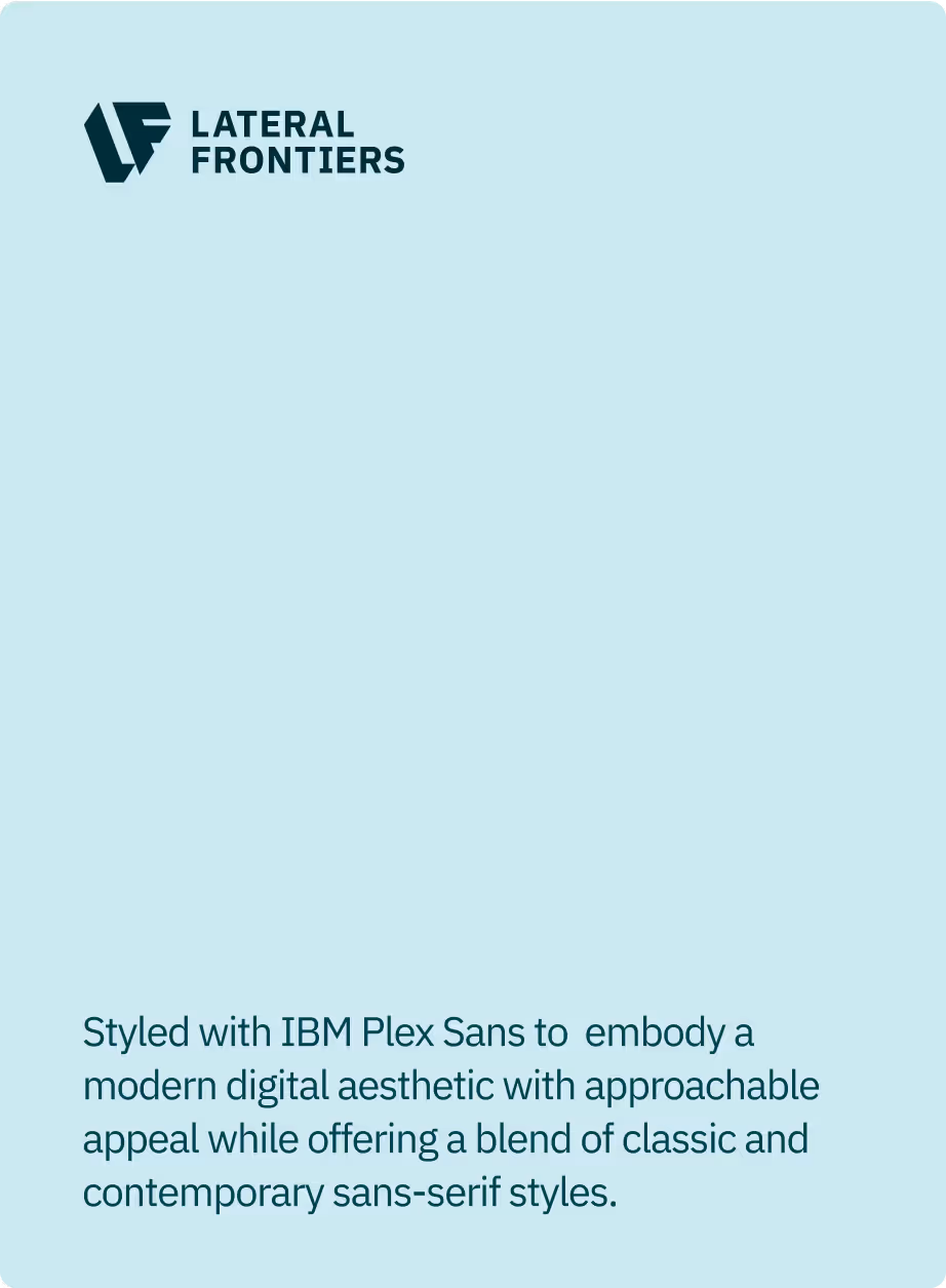
Typography → IBM Plex Sans and complementary fonts gave the brand a timeless yet modern tone, bridging classic credibility with a digital-forward aesthetic.
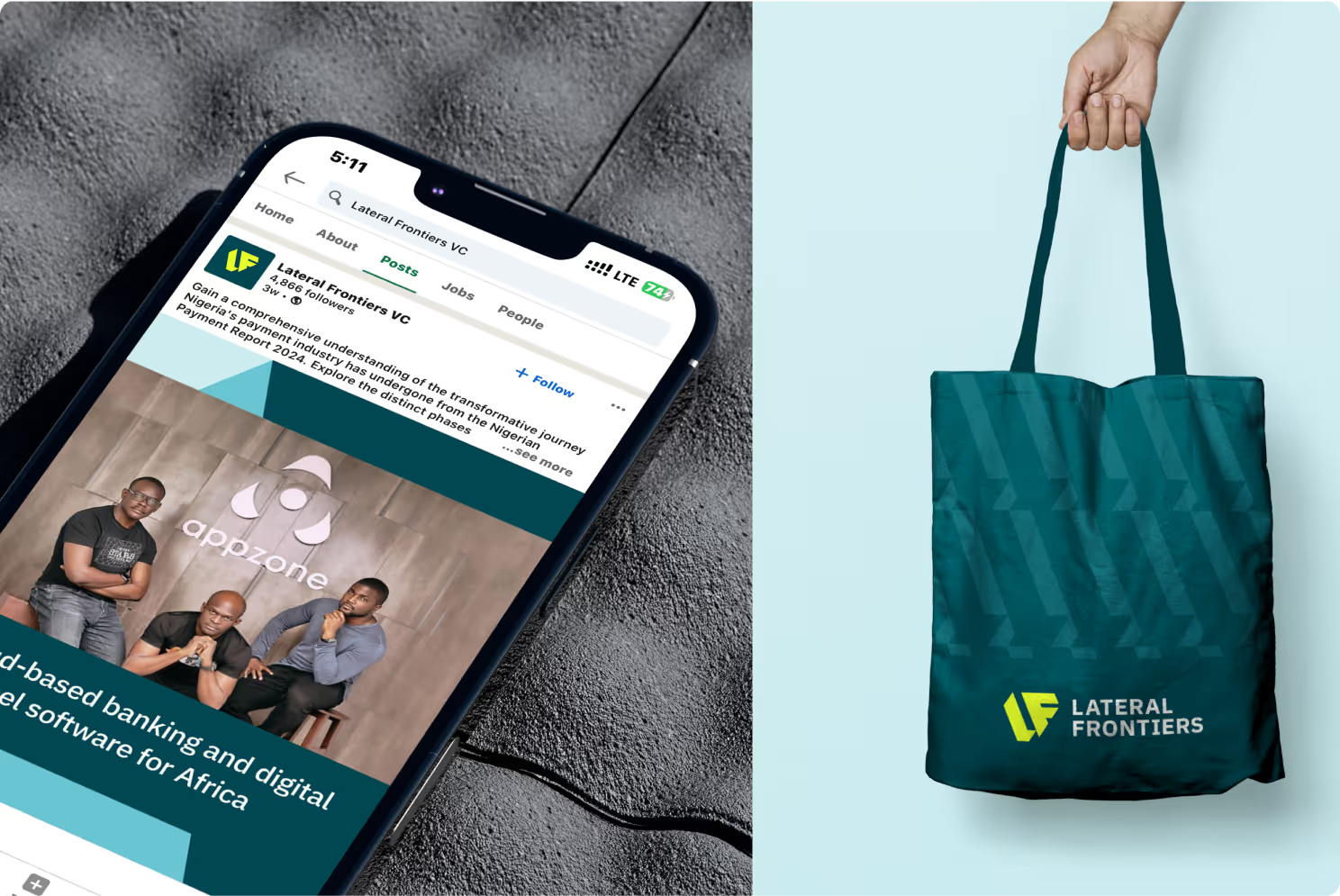
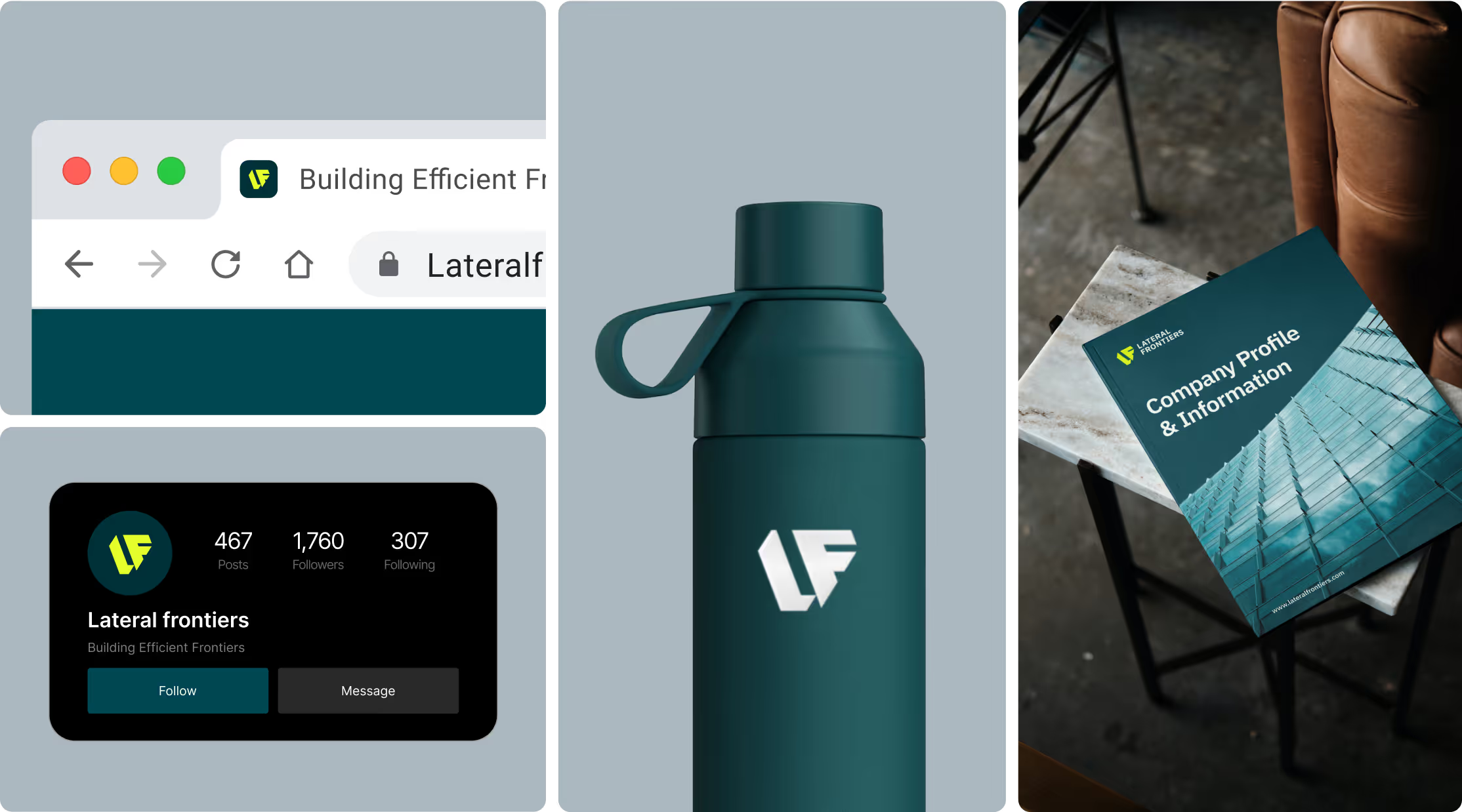
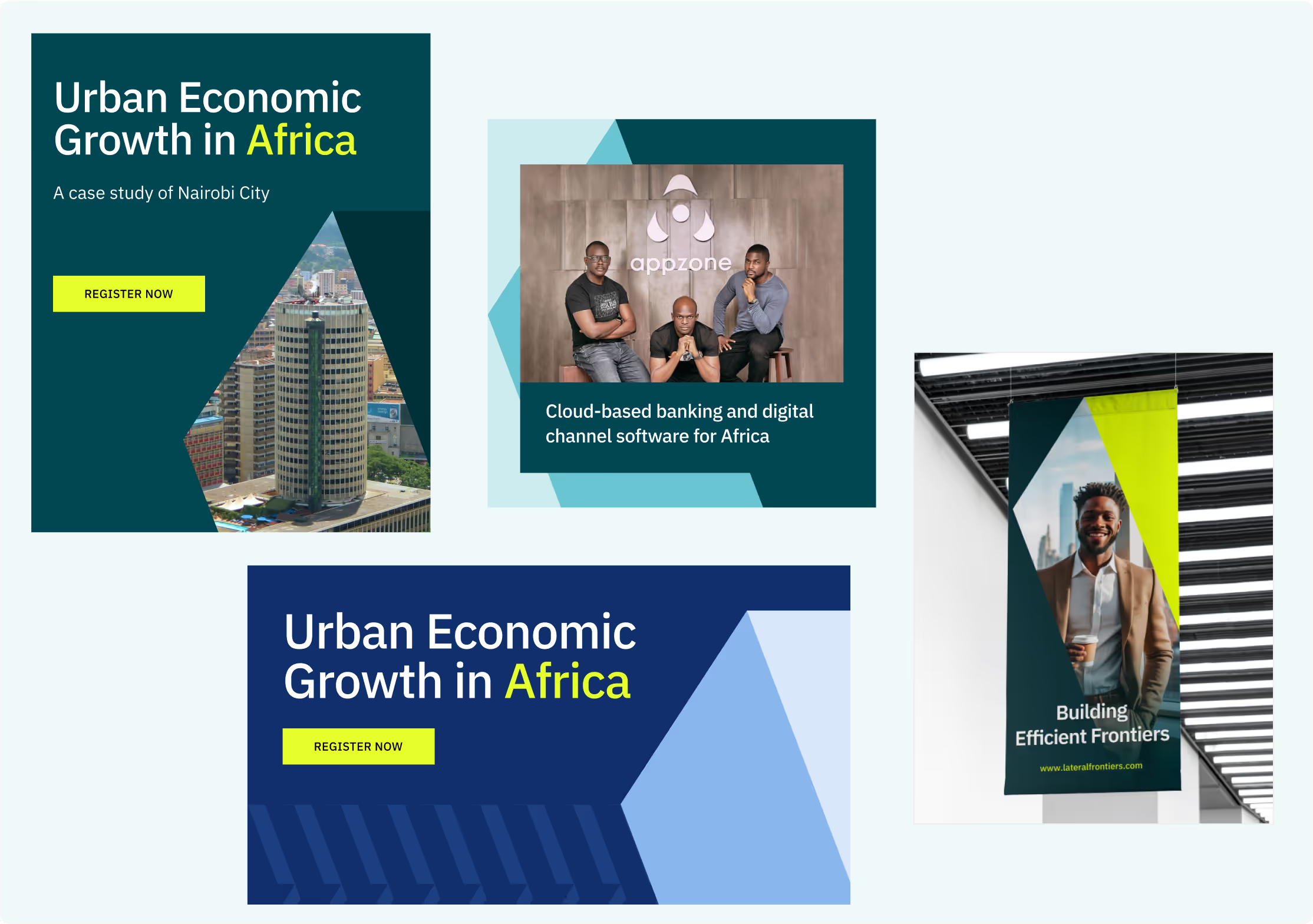
Brand Guidelines → We built a flexible system ensuring Lateral’s visuals scaled seamlessly across decks, websites, reports, and social platforms.


( Visual Identity
Evolution )
The old brand undersold Lateral’s ambition. The new identity elevated the firm into a global investment player.
The monogram added distinctiveness, while the color and type choices created a fresh, trustworthy presence. Every visual asset was crafted to communicate confidence, clarity, and credibility.


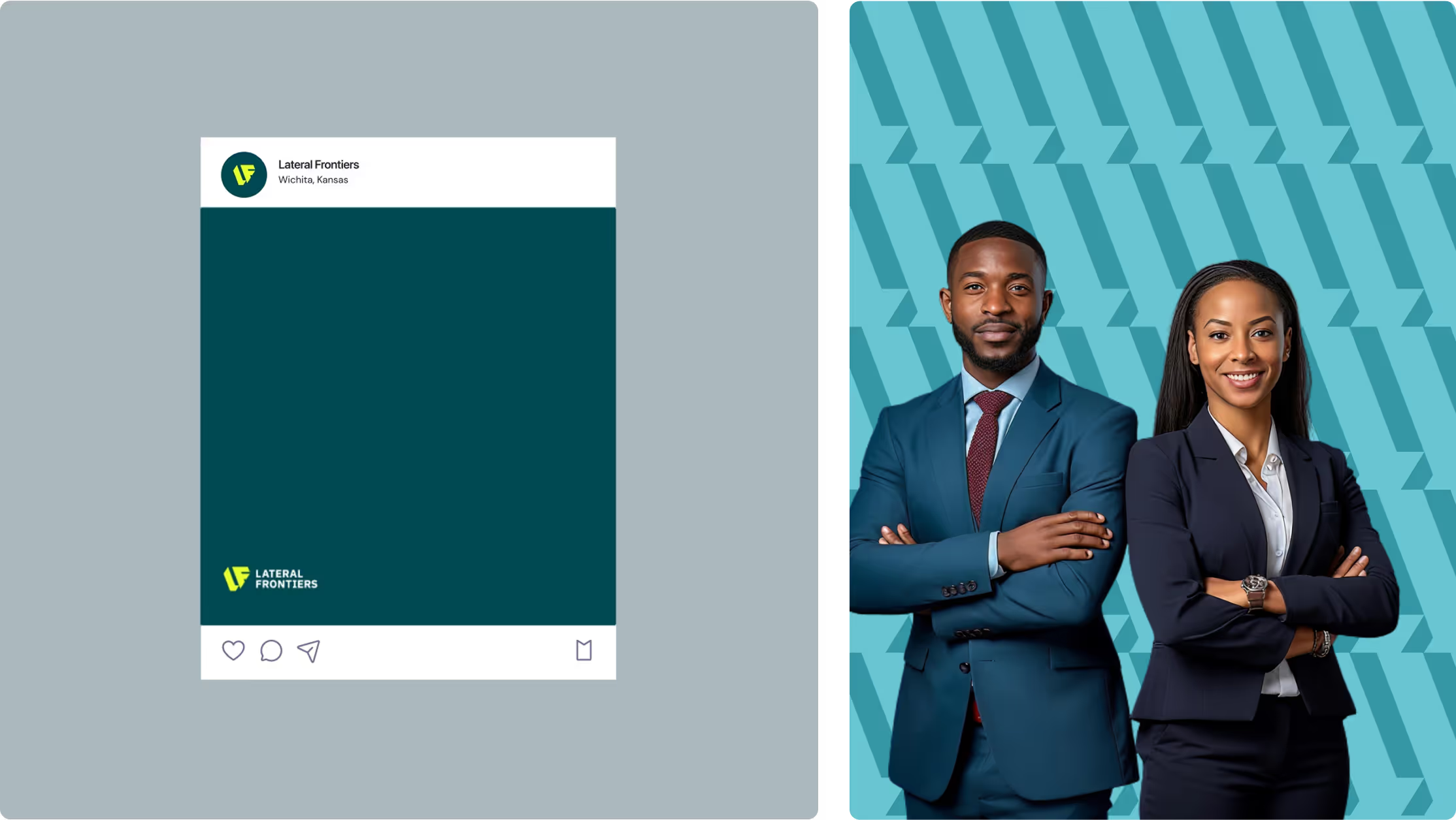
( Investor & Founder Alignment )
We designed the identity to speak to two core audiences:
This balance ensured the brand resonated at both the grassroots and global investment levels.


( RESULTS )
The refreshed brand redefined Lateral Frontiers’ perception in the VC space:
Positioned the firm as a bold, future-forward investor in frontier markets.
Strengthened credibility with global LPs and institutional partners.
Enhanced founder engagement, with the brand now viewed as more approachable and trustworthy.
Provided a scalable design system that continues to support growth, media presence, and investor communications.

( TESTIMONIAL )

“Our new website reflects who we are as a firm, bold, innovative, and ready to build the future.
It’s an extension of our brand and has become a powerful tool in connecting us with the founders and investors we aim to partner with.
Working with Rvysion was seamless. The team turned our brand into a stunning website coming from where we were, this is quality work and meets us where we are and want to be”
( WEBSITE REDESIGN FOR LATERAL )
Lateral Frontiers → Redesigning the Web Presence of a $89B+ Portfolio VC Firm
Every project is rooted in clarity, story, and standout execution.


.avif)