


Rayna UI → Designing the Identity Behind 10,000+ Downloads
How the Rvysion team helped craft a scalable identity for a design system with 10,000+ downloads
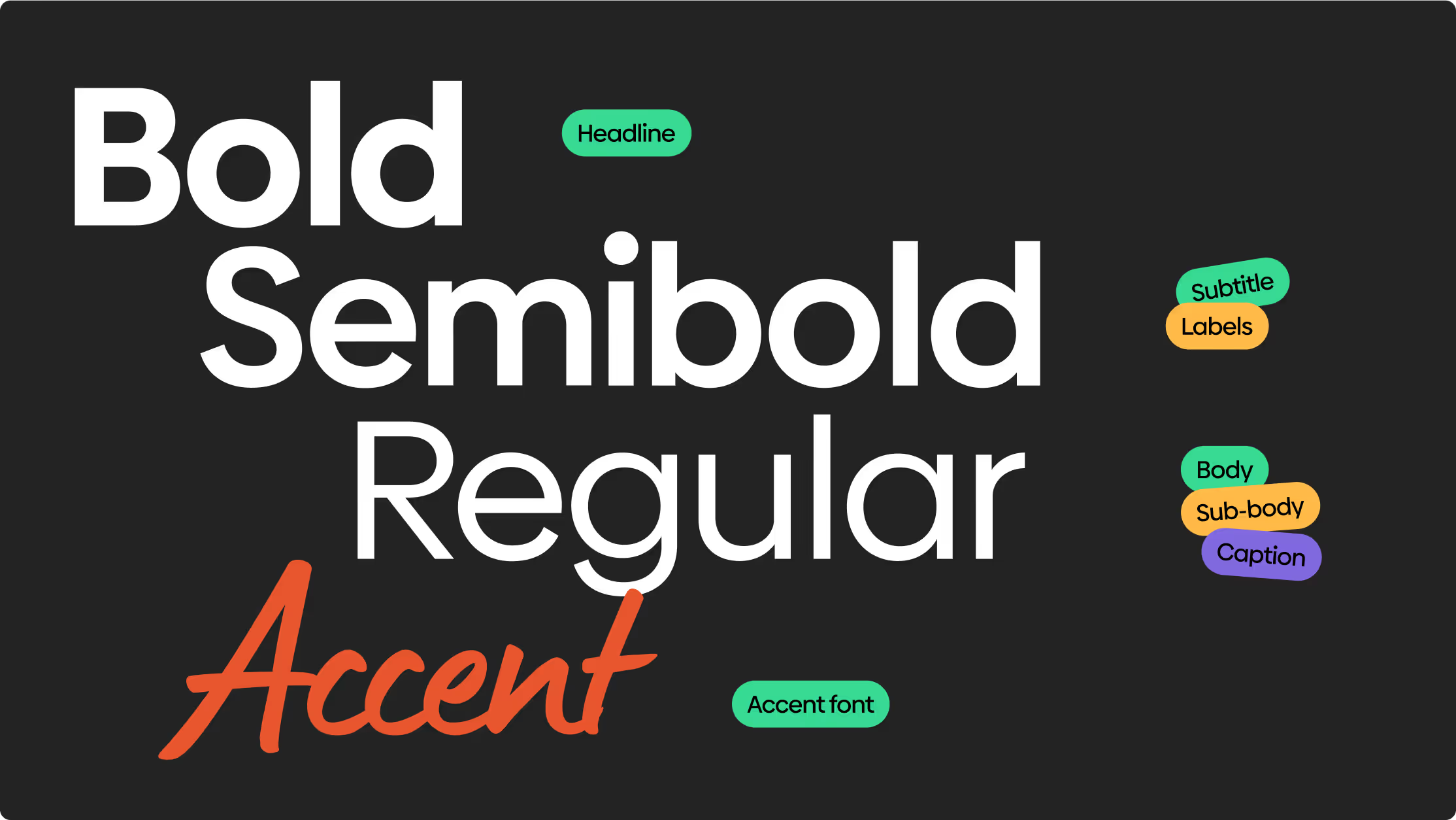
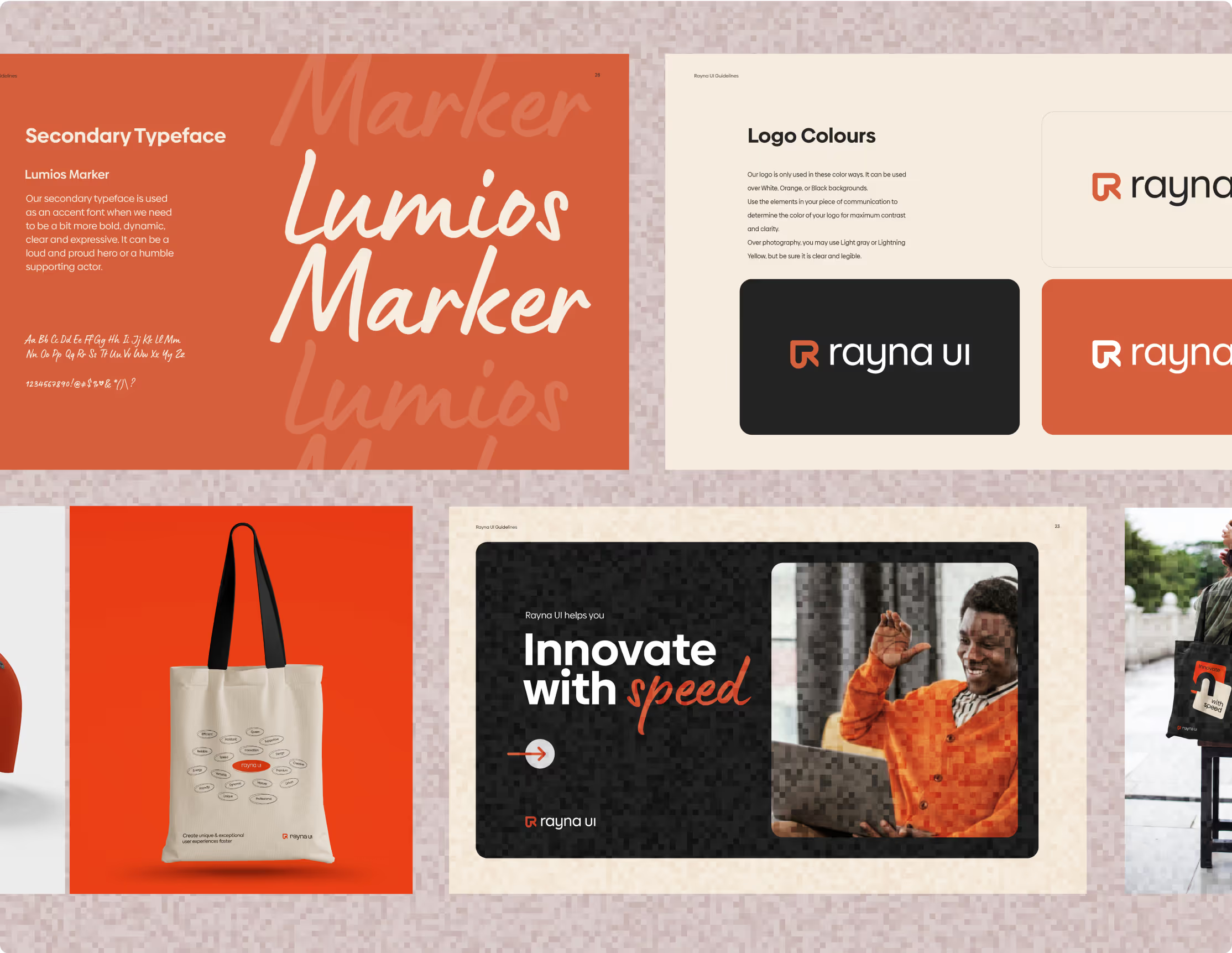
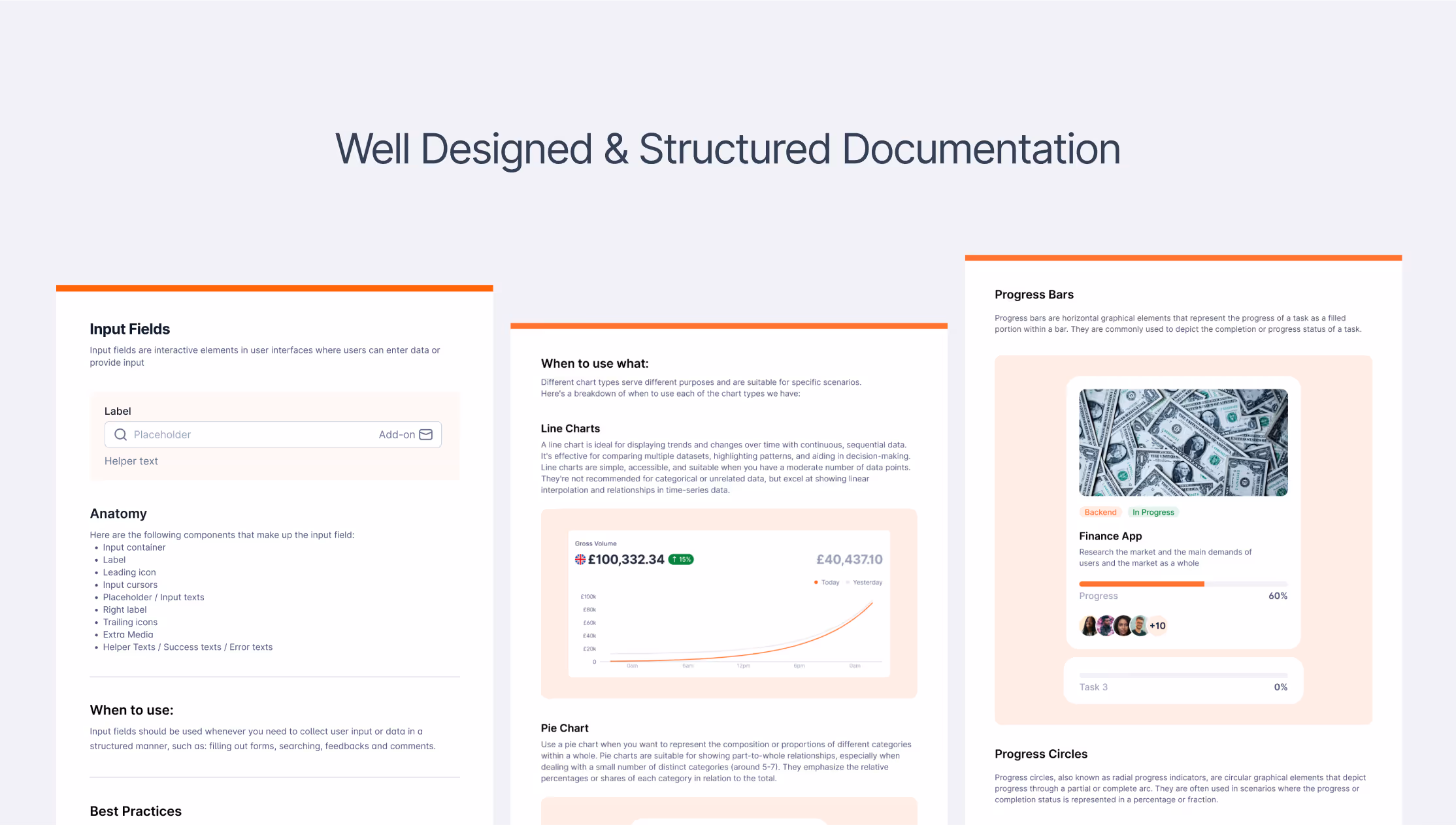
Design System Guidelines
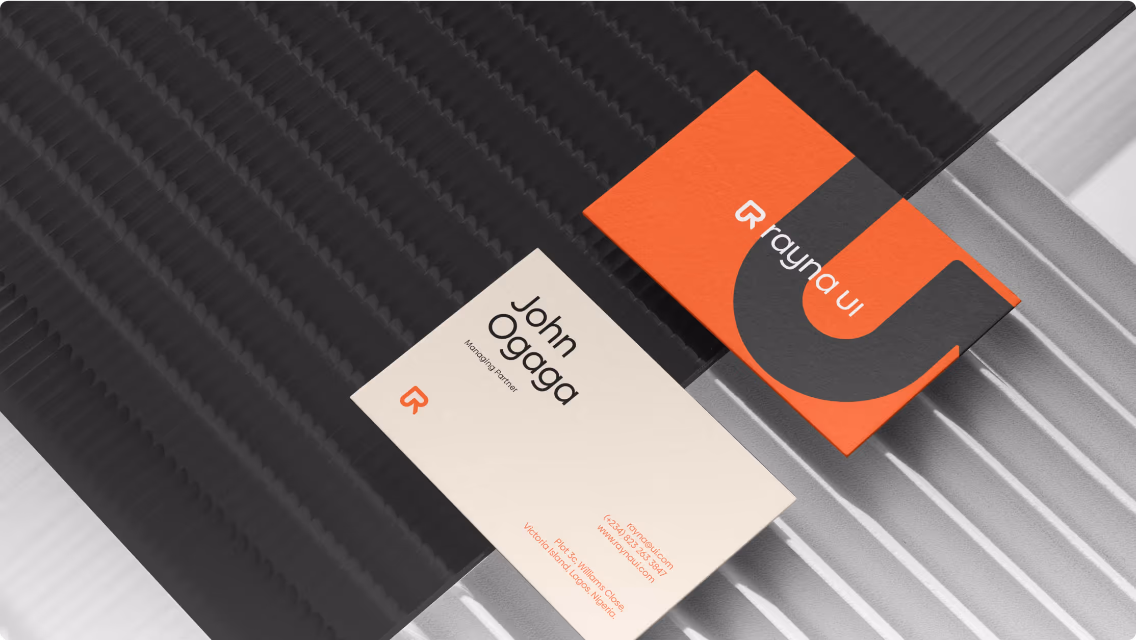
( THE BRAND )
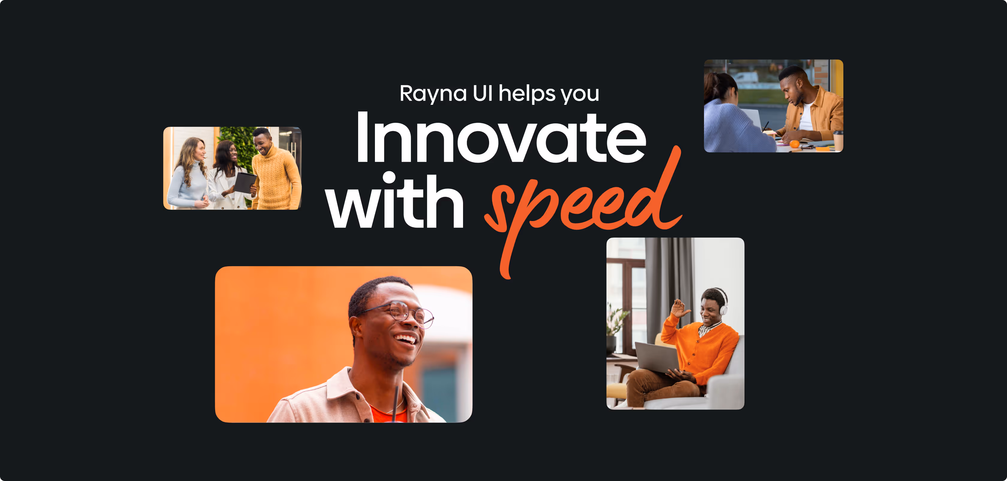
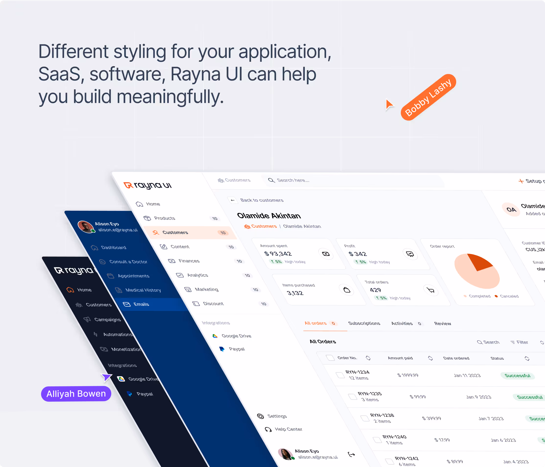
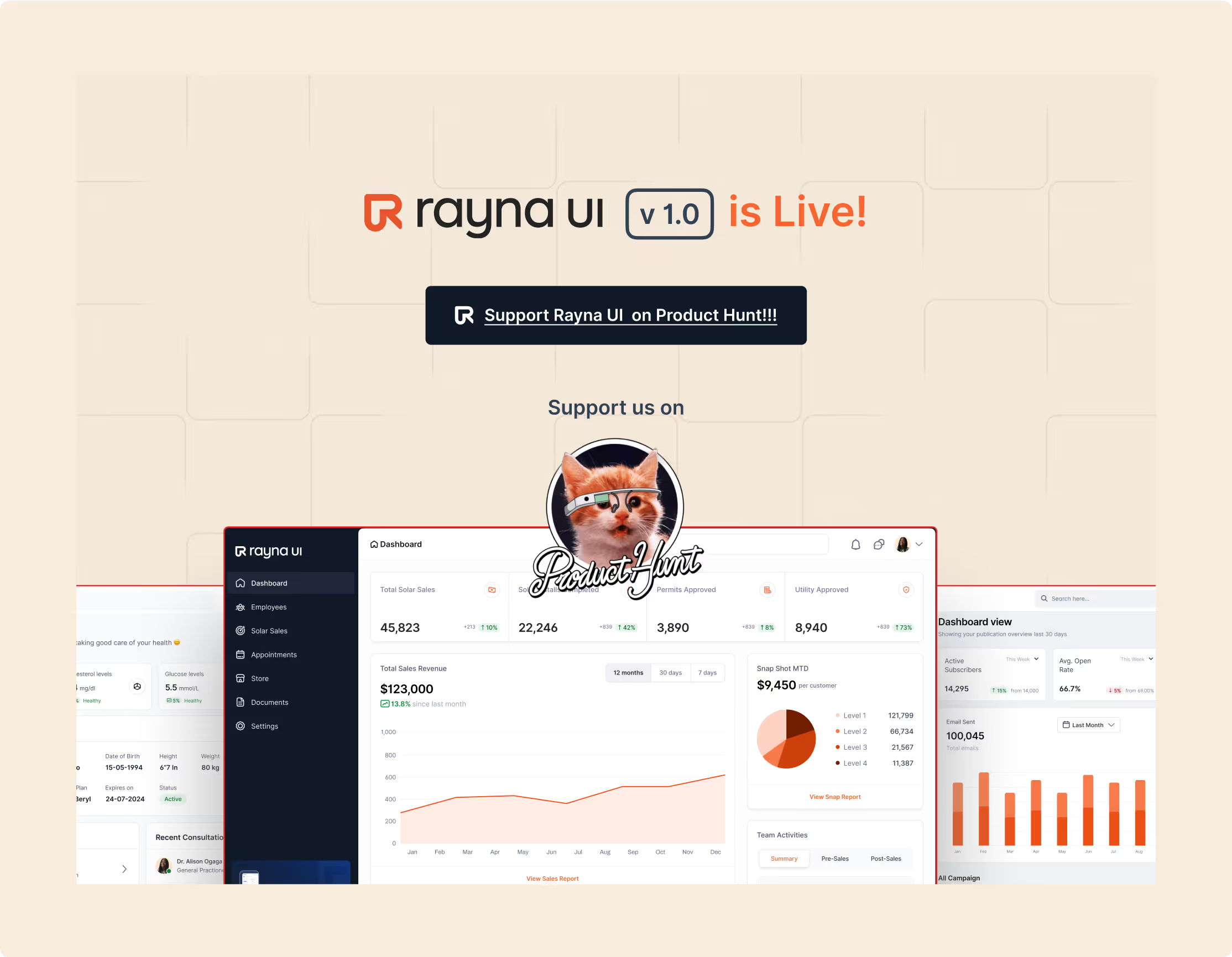
Rayna UI is a cutting-edge design system created by Rvysion to help teams build interfaces faster and with more consistency.
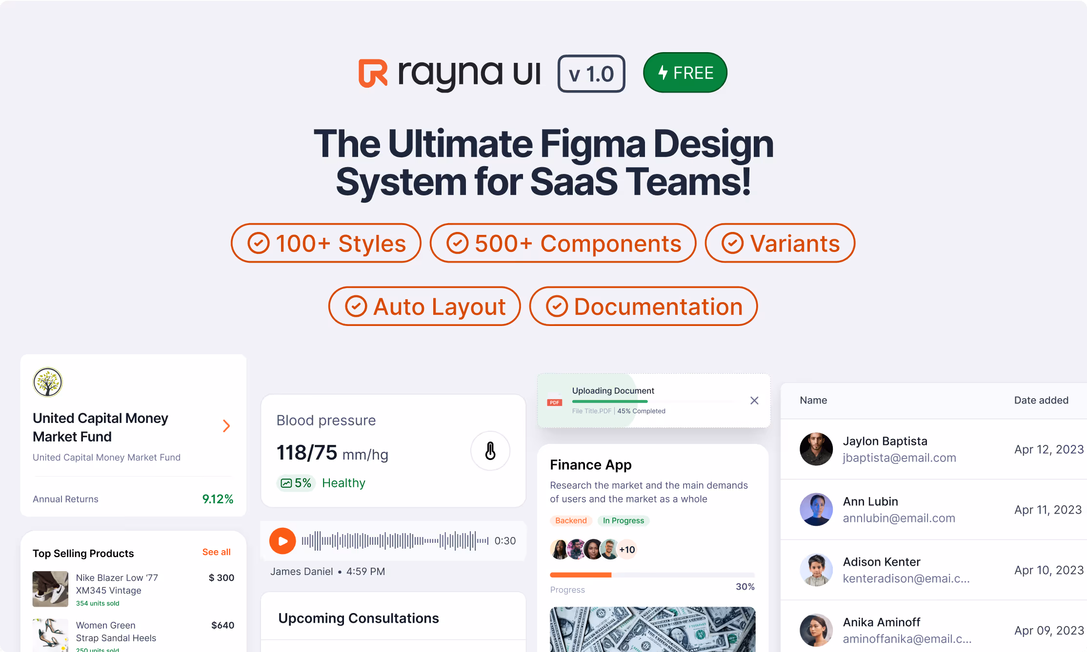
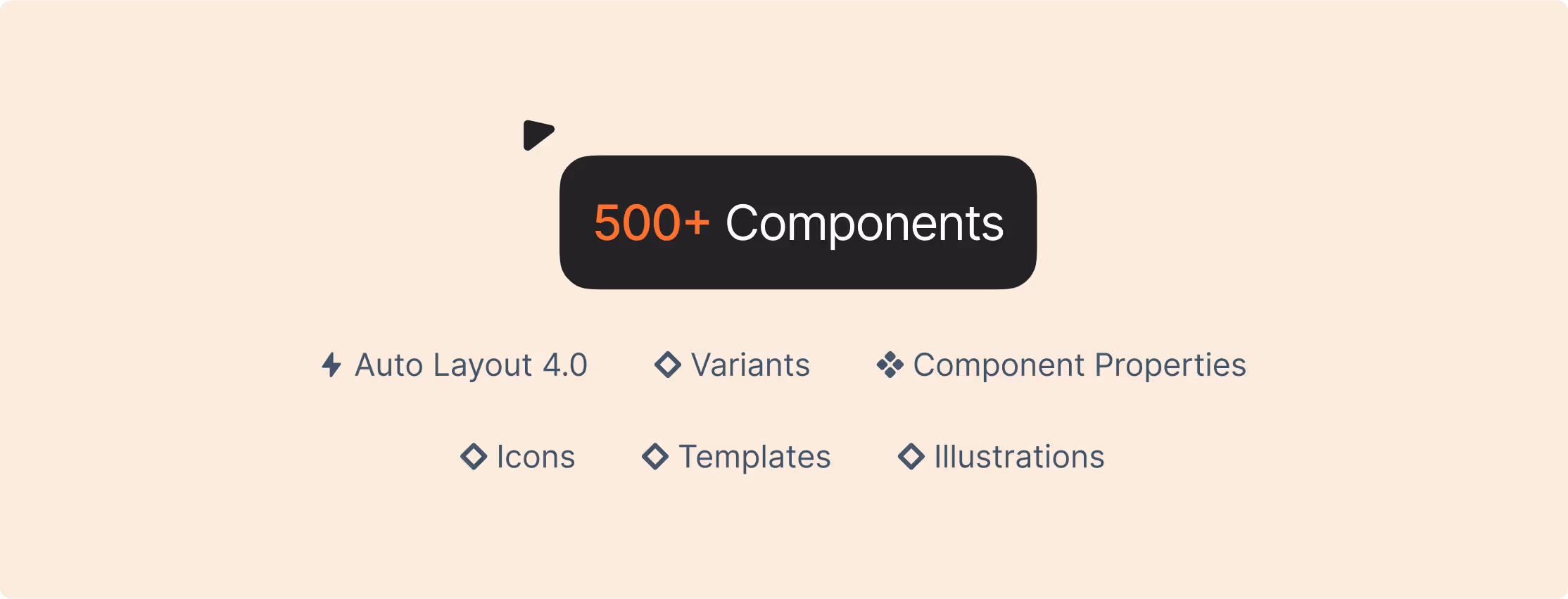
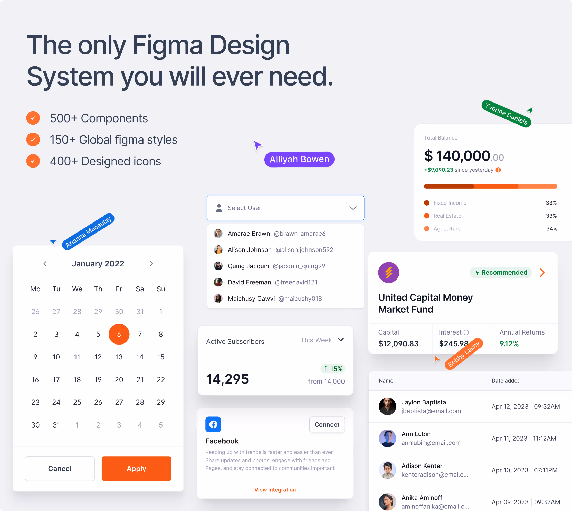
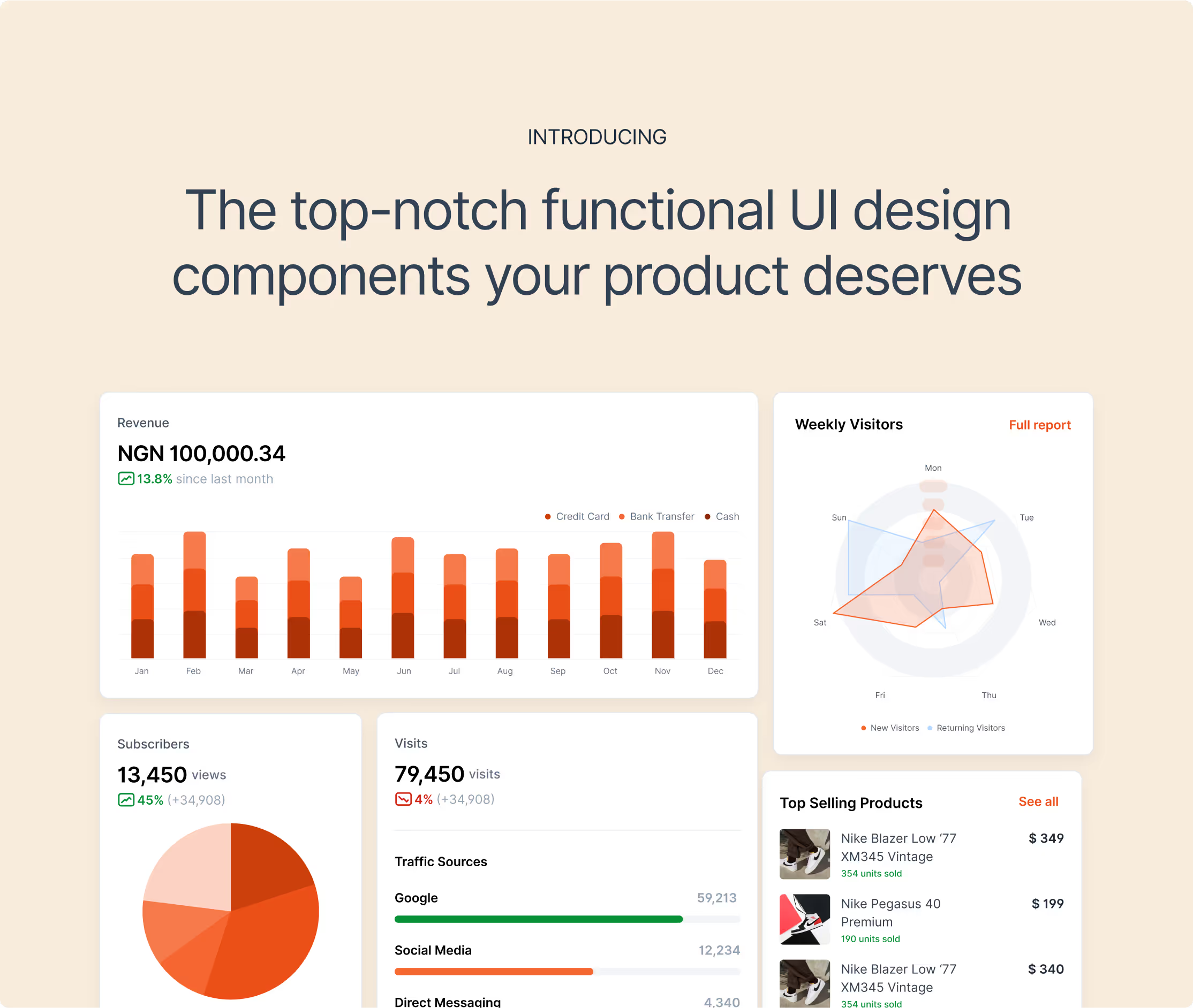
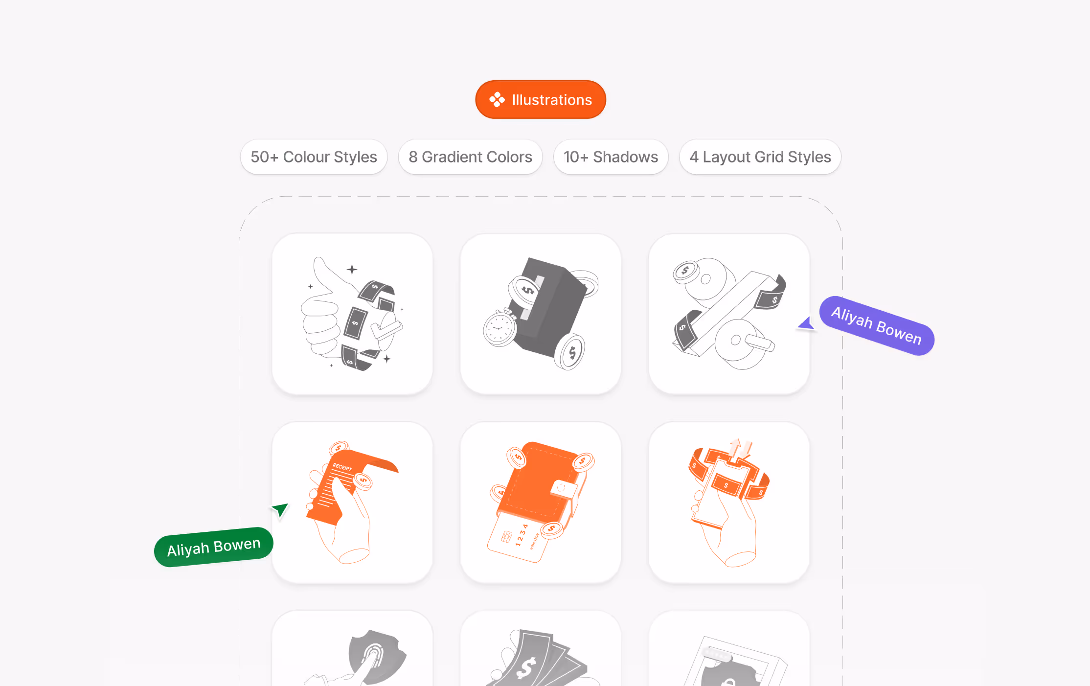
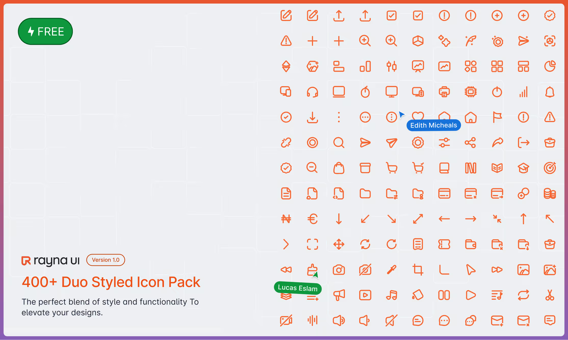
With 500+ components, 150+ global Figma styles, and 400+ icons, Rayna UI quickly gained adoption among startups, freelancers, and design teams worldwide.
To support its growth, Rayna UI needed a brand identity that reflected its technical sophistication, modularity, and accessibility, appealing to both designers and developers, while standing out in the crowded world of design tools.
( THE CHALLENGE )
Unlike client projects, Rayna UI had to compete in a global marketplace of design systems. It needed:
A unique, recognizable identity that captured modularity and speed.
A flexible visual system that could scale across product, website, community events, and marketing campaigns.
A brand that inspired trust and adoption among thousands of users while still feeling approachable to indie designers and startups.
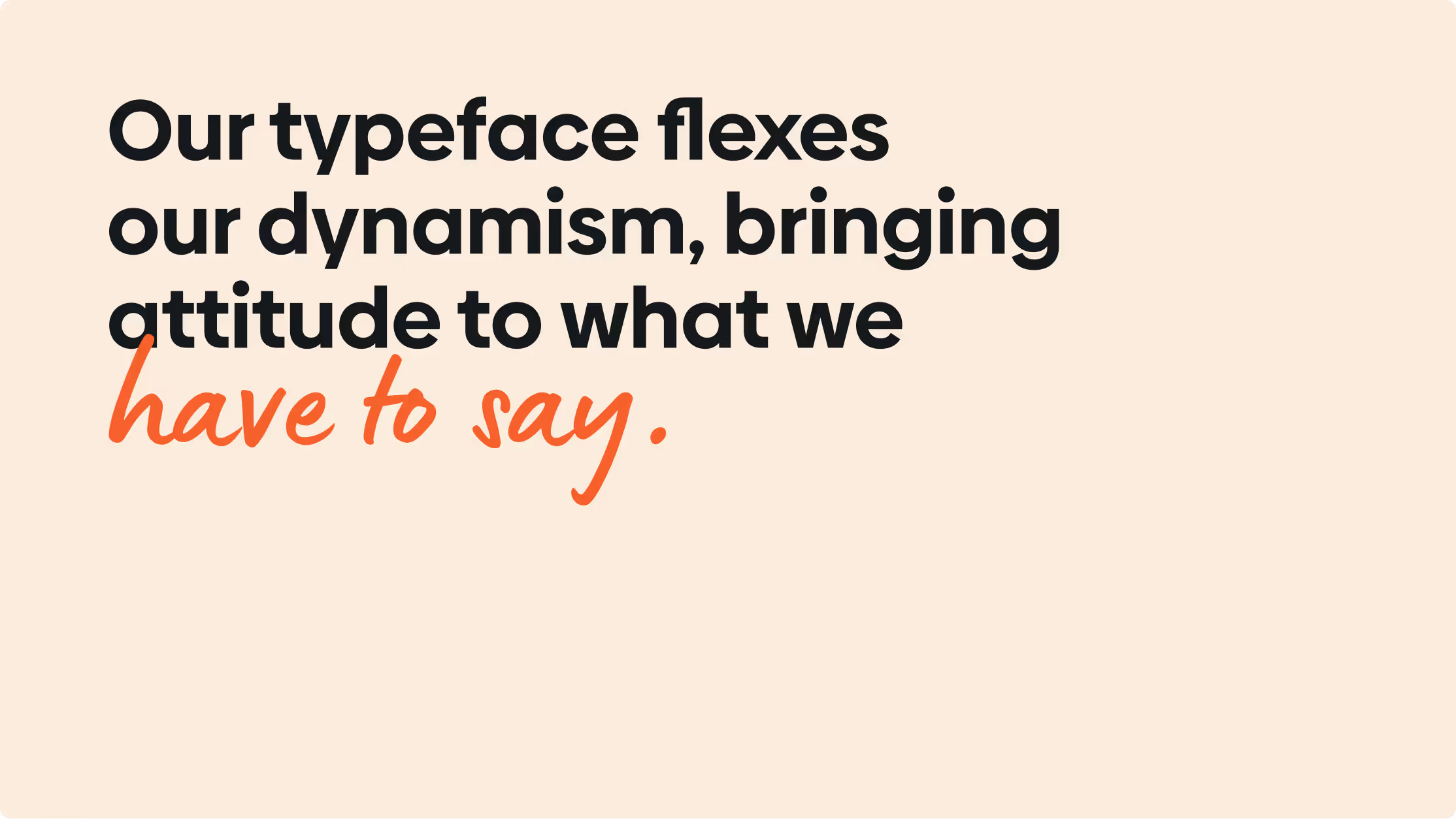
( THE APPROACH )
We began by immersing ourselves in the story behind Lateral Frontiers. Their unique approach to venture capital is driven by deep engagement with founders and a commitment to supporting companies that tackle large, complex problems. This understanding became the foundation of our branding strategy.
The new logo was designed to symbolize the Lateral’s role as a catalyst for growth and innovation. We created the “LF” monogram, representing the fusion of innovation and collaboration, two key pillars of Lateral Frontiers’ identity. The bold green and lemon yellow palette represent energy, growth, and optimism, aligning with the Lateral’s mission of helping founders lead in frontier markets.


( THE CHALLENGE )
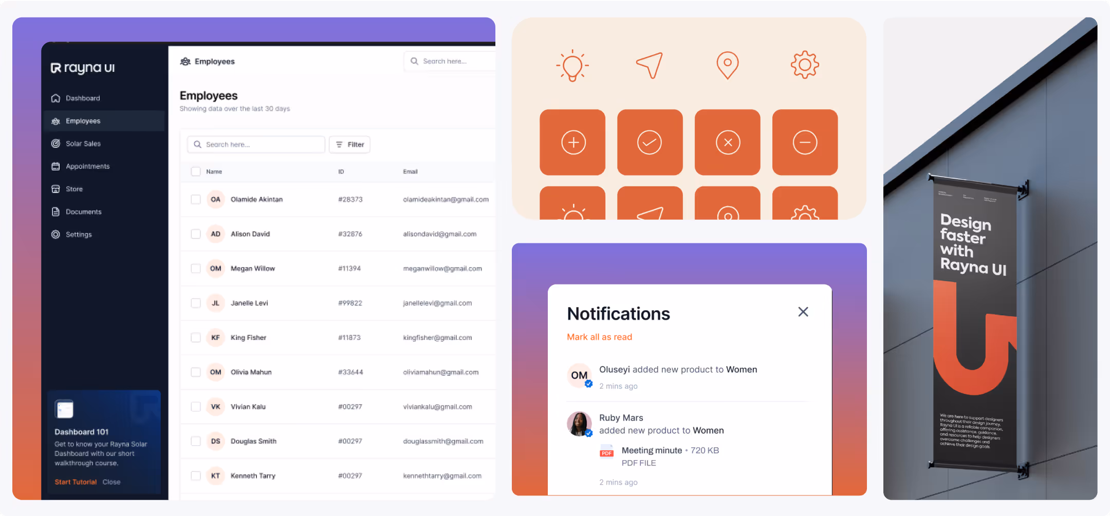
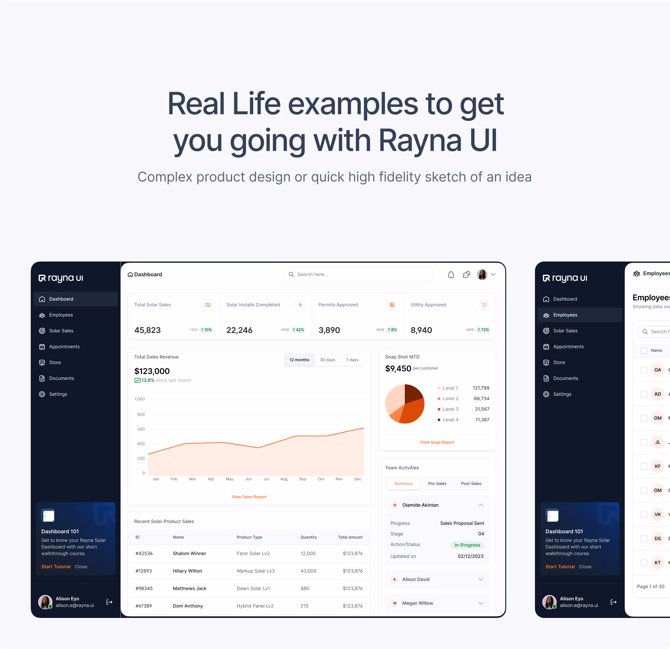
We designed Rayna UI’s identity to be living and flexible, built to thrive across different contexts:
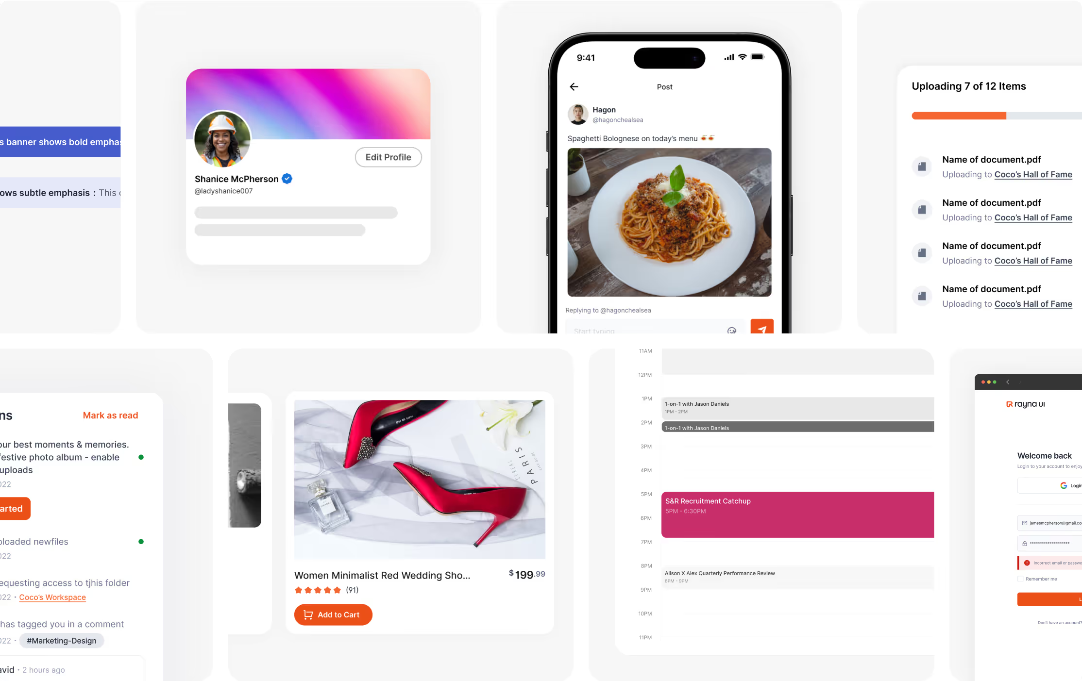
Digital → integrated into the design system itself, product dashboards, and documentation.
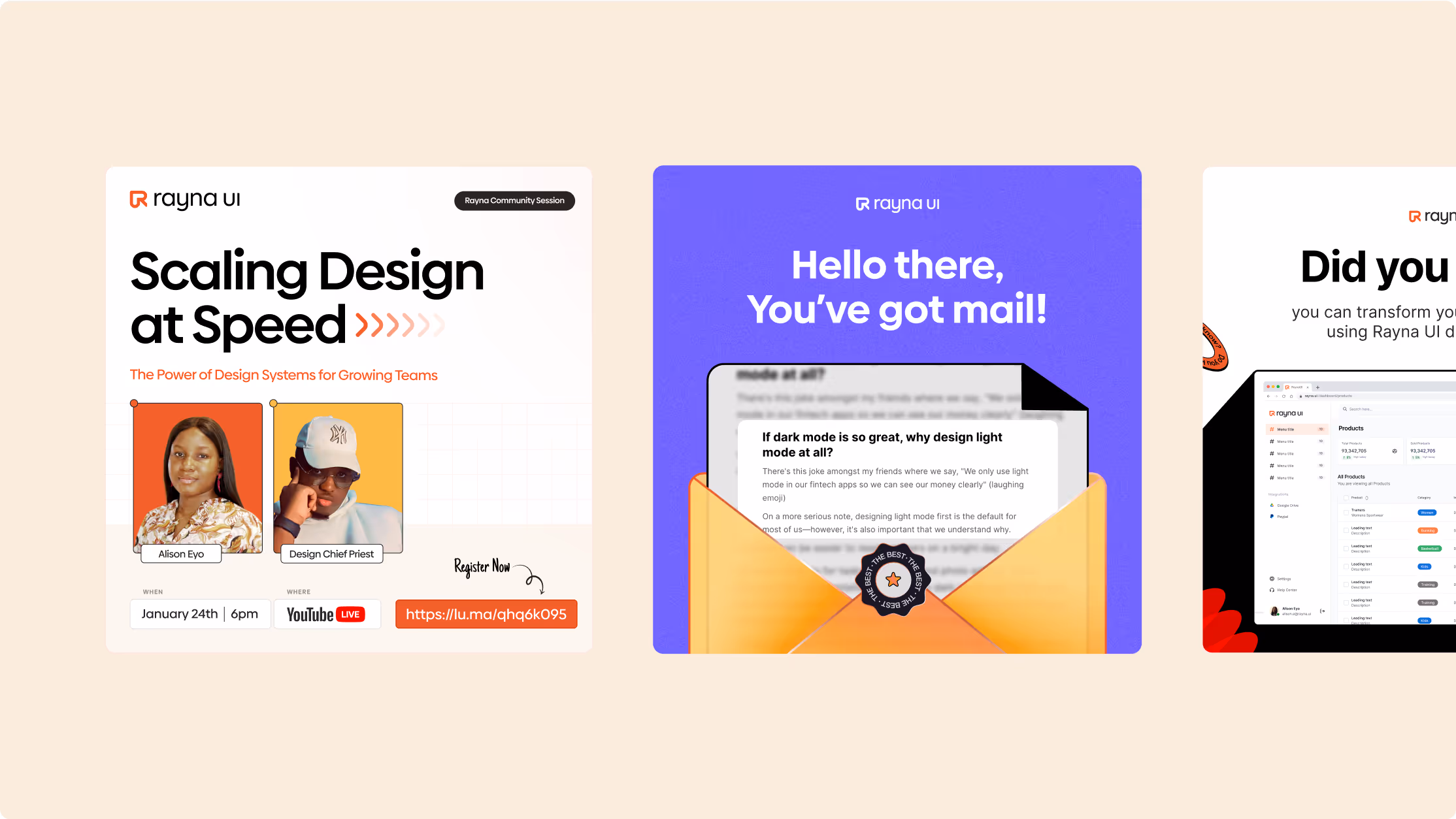
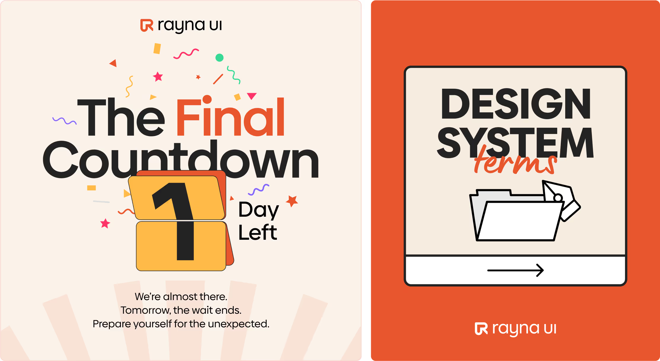
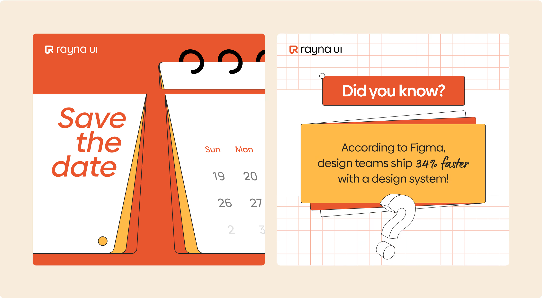
Marketing → applied across social templates, launch campaigns, and community events.
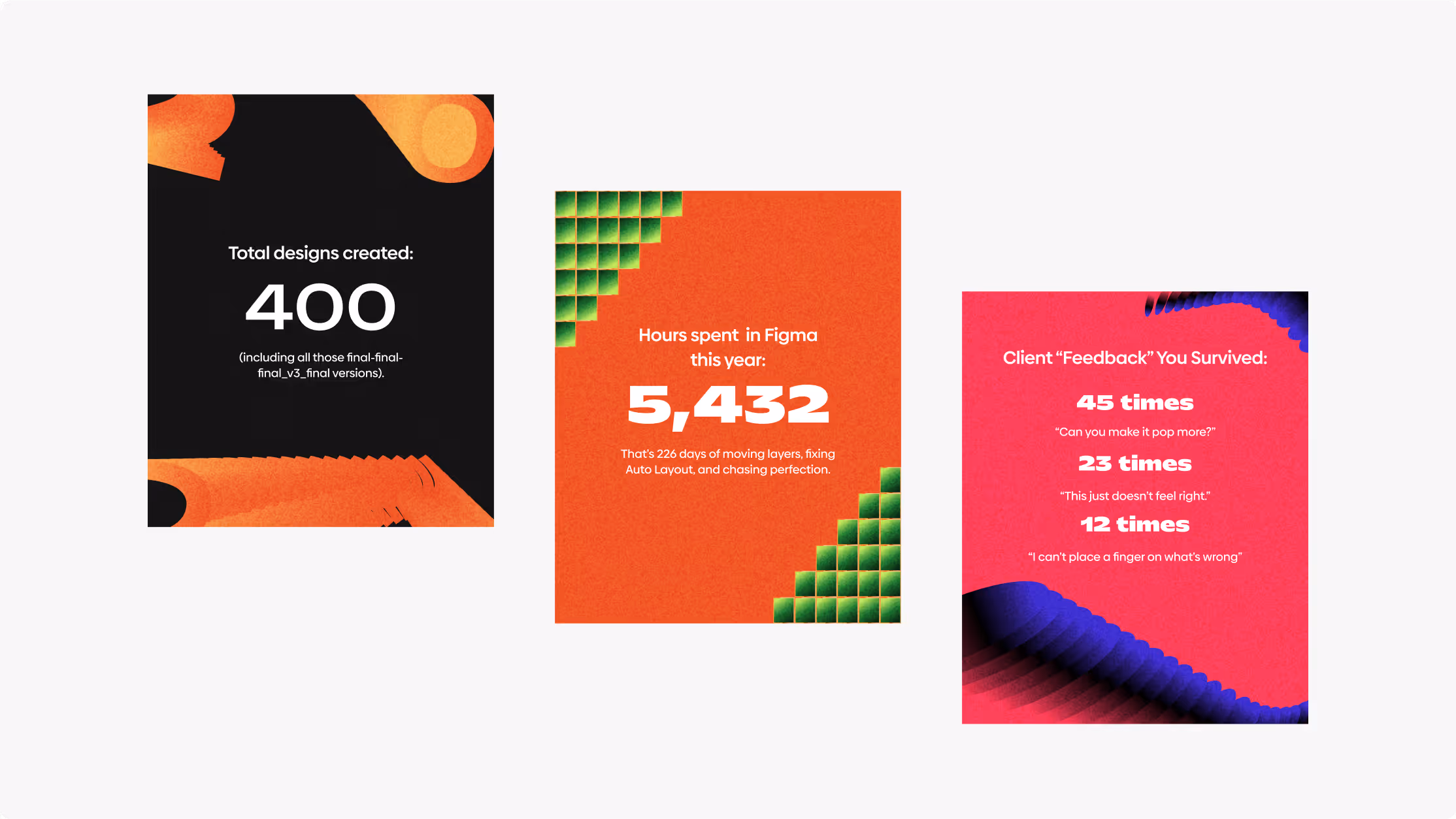
Community → used in webinars, workshops, and the growing Rayna UI design community (e.g., Rayna Sessions: Scaling Design at Speed).
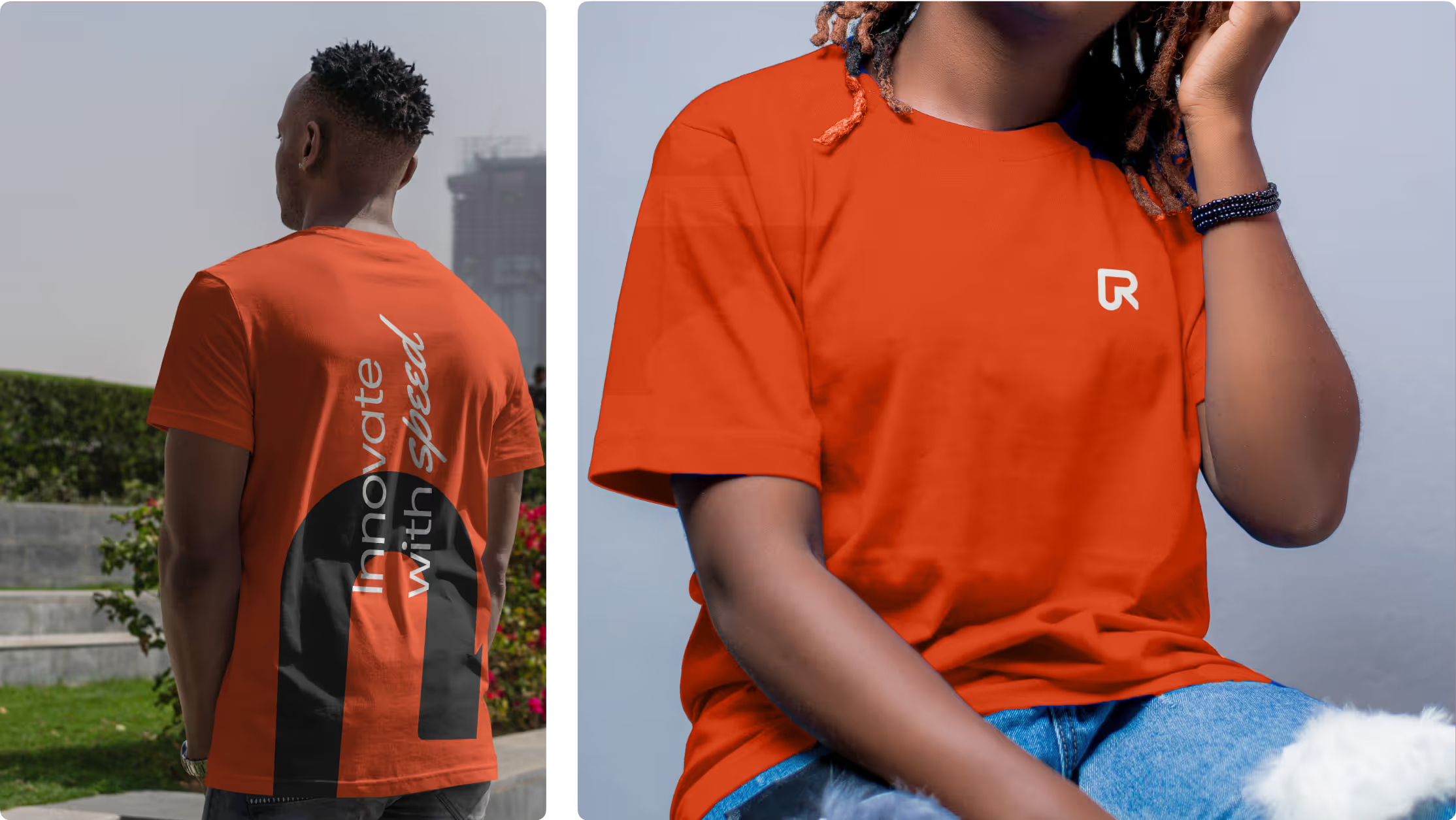
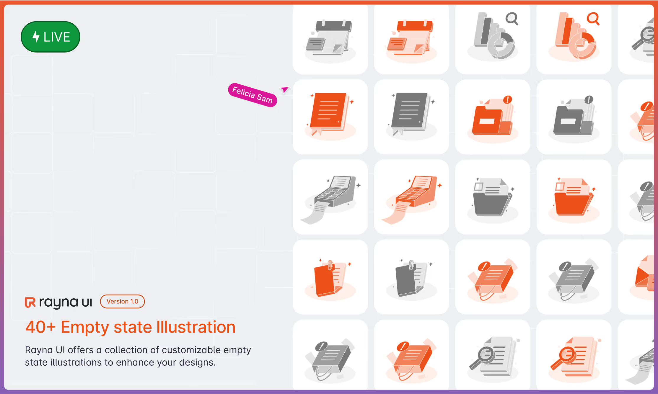
Merchandise → adaptable for stickers, t-shirts, and other community swag.


%20(11).avif)
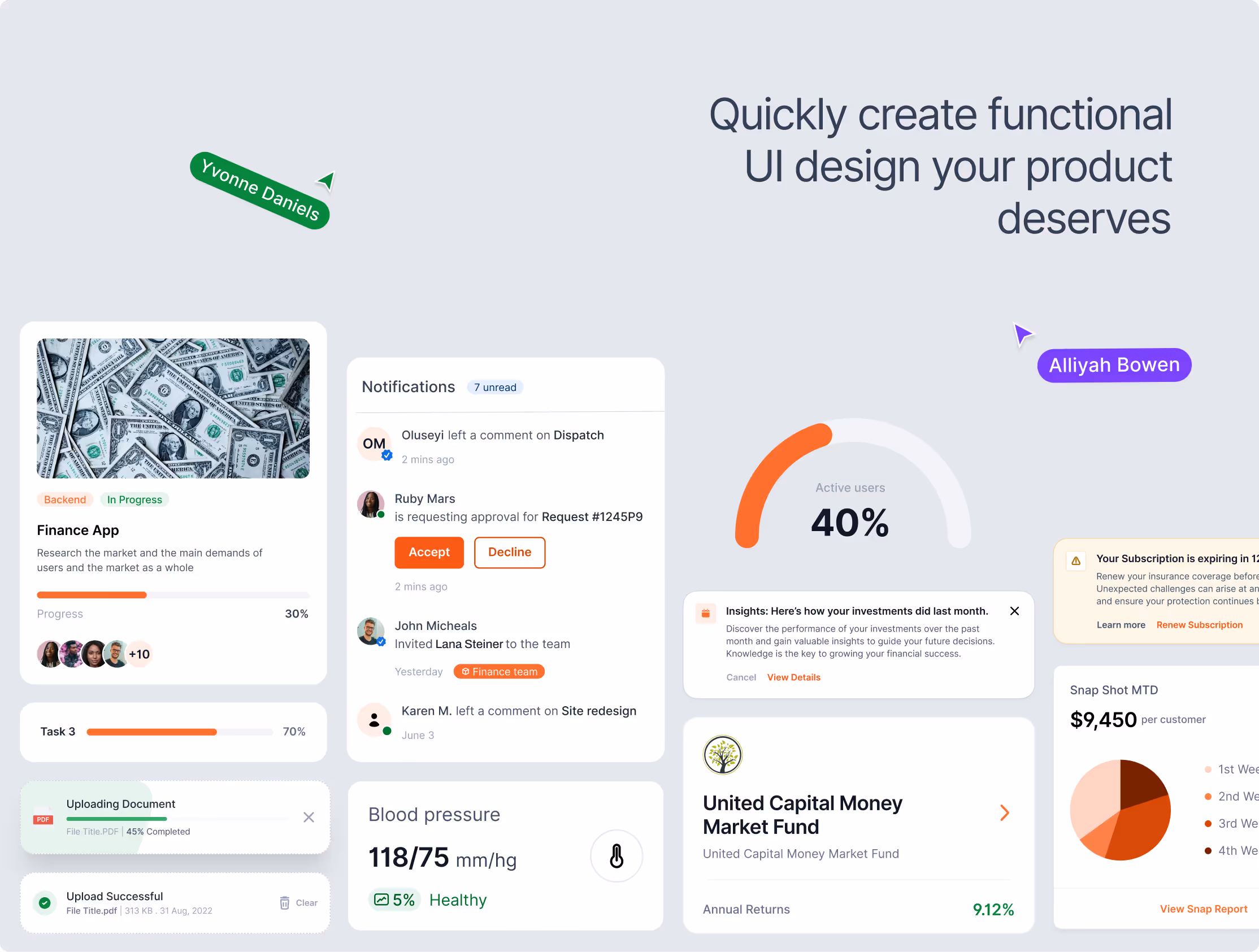
( Extending the Brand Into the Design System )
Rayna UI’s brand identity wasn’t created to live in isolation, it was built to work hand in hand with the design system itself. Every decision, from the logo geometry to the color palette, was guided by the principles of scalability, modularity, and collaboration.
This alignment meant that the brand and product evolved together, no disconnect between what people saw in the marketing and what they used inside the product.

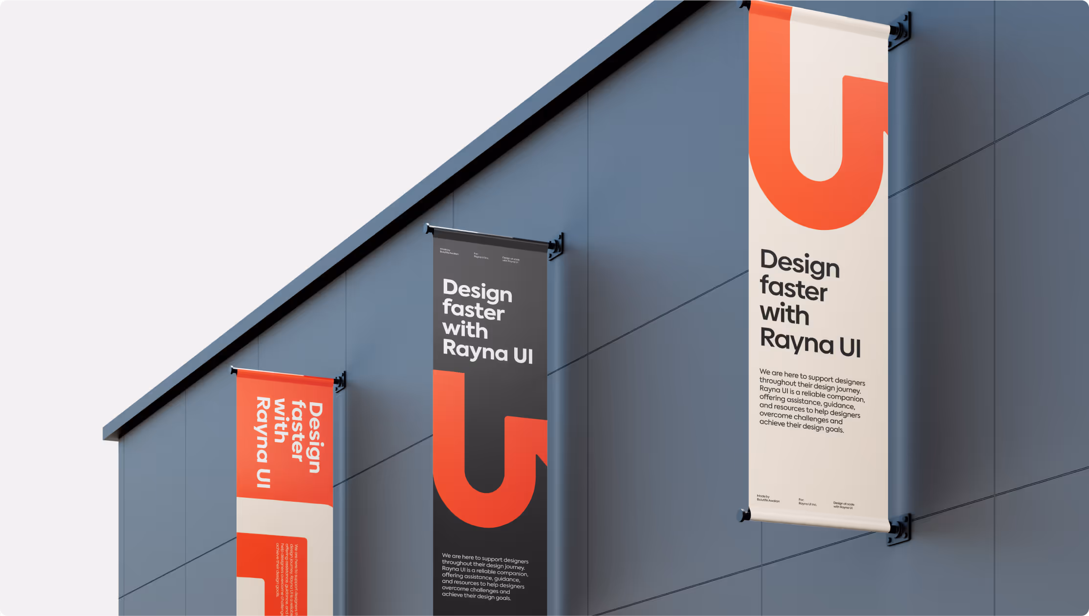
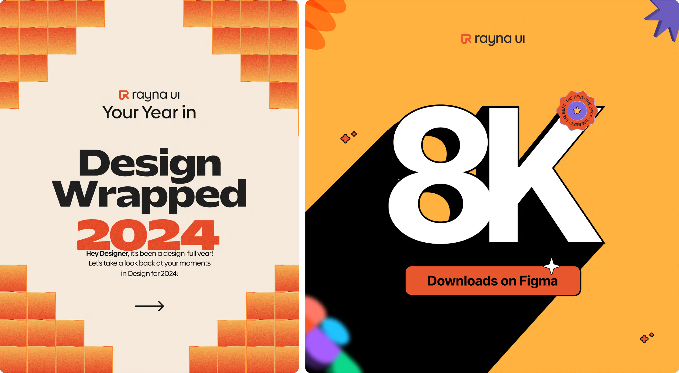
( Launch Materials )
The brand identity also extended into launch campaigns and community-facing content, ensuring Rayna UI entered the market with clarity and energy. this eventually helped us launch #7 product of the day on Product hunt.
( THE CHALLENGE )
Because the branding was woven directly into the product and its launch materials, Rayna UI quickly gained traction:
Over 10,000+ downloads.
Recognized across the design community as a trusted system for scaling teams.
Strengthened Rvysion’s position not just as a design partner, but as a builder of design products adopted globally.
The challenge was to evolve Honeycoin’s brand into a professional, trustworthy, and future-forward identity, without losing its creative edge.
( TESTIMONIAL )

Rayna UI’s new brand identity gave us the clarity and professionalism to scale beyond just a side project.
It helped us gain traction, recognition, and trust within the global design community.
Every project is rooted in clarity, story, and standout execution.


.avif)